New Uniforms for 2023: An Impartial Ranking

 As we approach kickoff for the 2023 Hall of Fame Game in Canton and the official start to the 2023 Preseason, let us take a few moments to review the new uniforms and helmets that we will be seeing throughout the season.

I have ranked the 13 new uniform additions by team, whether it be a single new helmet or a completely new uniform. Additions that were used last year like the Pat Patriot throwback helmet/uniform in New England or the return of the red helmet in Atlanta are not included.

Here we go.

#13 - INDIANAPOLIS COLTS


Nothing about what the Colts did makes sense. They have a regular blue jersey. They have a blue throwback jersey. Why do they need a third blue jersey? From a distance, the pattern in the new blue jerseys will likely be hard to detect. The black outlines around the white numbers will be hard to notice due to being against the aforementioned blue. And this doesn't even take into account how ridiculous these jerseys will look if the Colts also add 'Captain' patches onto the other side opposite the alternate logo placed on the left collarbone.


As for the black helmet, we likely should have seen this coming as a few years ago the Colts changed the color of the Nike swooshes on their white jerseys from blue to 'anvil black.' So does that mean anvil black is now a Colts color?

The Fix: The Colts should have just kept it simple and only added a dark-royal-bordering-on-navy helmet to pair with the blue throwbacks. When you overthink, this is what happens.

Grade: F


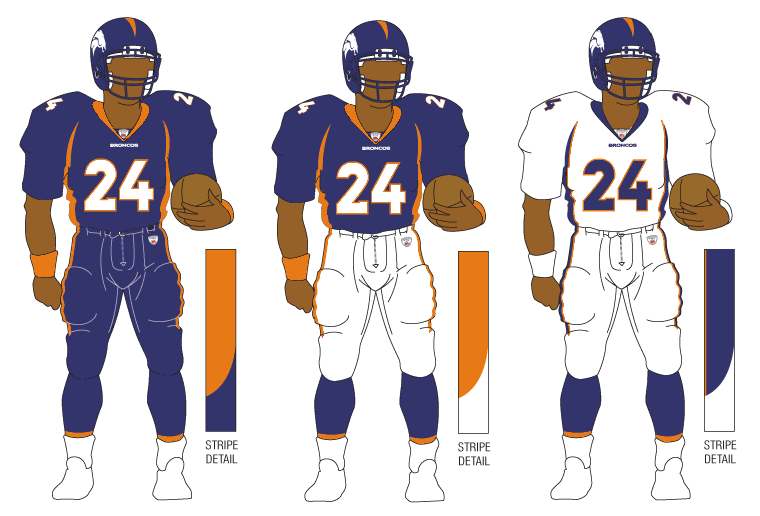
#11 (tie) - DENVER BRONCOS

There's a tie for the  #11/#12 spots. Denver comes first alphabetically so I'll explain them first.

A white helmet. That's it. To be paired with Color Rush / Throwback-styled orange jersey and orange pants. 


Why? What does Denver gain from this? They aren't going to have lucrative merchandising increase for a new helmet. The Color Rush costume hasn't changed (the helmet logo has minutely) since it came to be in 2016.

What's worse? In the reveal video, one Bronco is wearing the all-orange costume with orange socks, too. A second Bronco is wearing white socks paired with the all-orange. It doesn't seem like the team even knows what it's going to do with them.

The Fix: Denver has had the same Color Rush uniform since 2016. Alter it by replacing the navy blue with light royal blue trim. Add a light royal blue helmet in the same style. Add appropriate stripes to the socks. Boom.

Grade: D+


#11 (tie) - DETROIT LIONS

A new blue helmet is added for the sole purpose of pairing it with the awful all-grey Color Rush uniform.


I'll ask again...Why? The short answer is that the all-grey uniform didn't match with the normal Detroit silver helmet. I can understand that. But then you create a blue helmet to rectify that one problem and you don't even bother to correctly match the blues of the helmet and jersey? At least it matches the blue of the anniversary patch the Lions will be wearing this year.

The Fix: Detroit's heart was in the right place and their intentions were good. Fix the helmet's shade of blue to match. This oversight reminds me of when the Vikings brought out their current look and their helmets bore a shade of purple that looked like the paint guy at Home Depot put in a little too much red and way too much white when trying to match colors resulting in a lighter, redder shade of purple. It's an easy fix. Admit it. Fix it. Boom.

Grade: D+ (can go to a C if they fix the blue)


#10 - HOUSTON TEXANS

This change may well have slipped under the radar. Select teams are not only adopting Nike's new FUSE template for their jerseys this season, but a small percentage are also using a modified version of the FUSE that has a straight seam across the upper chest rather than the more visible V-shaped seam. Houston is one of those teams. Incorporating that modified FUSE has enabled Houston to 'flip their horns.' Since their inception, the Texans' shoulder stripes (horns) have narrowed to a point directed away from the body. These new horns curl ever so slightly towards the center of the torso instead.


Was this change needed? No. Will it change how we view the Texans' uniforms in a bubble? No.

The Fix: This was a change that wasn't needed. For good or for bad, there's nothing to really fix. It's just...different.

Garde: C-


#9 - CAROLINA PANTHERS

The Panthers' changes were two-fold. 

They altered the hoop-stripes. The only problem is that there are still going to be variations of how those stripes look due to the tailoring of jerseys for players of different positions. This is the same problem Carolina has had for a while.


The second change was in tweaking the shade of blue. Honestly, if no announcement had been made, you'd have been hard pressed to find someone in Bank of America Stadium that said "Gee. Their blue sure looks different this year."

So they altered the hoop-stripes but still have wide variations in how they will look. They changed the shade of blue and almost no one will notice.

The Fix: Find a way to tailor these stripes so that they appear the same on all player positions. Worse comes to worse, change them to look the same as the Colts' hoop stripes. Vary the width of the stripes rather than having all three the same as the Colts do.

Grade: C


#8 - ARIZONA CARDINALS

The uniforms that the Cardinals have worn for the past 18 seasons were dated and bad. Not a good combination. This is a change that needed to happen sooner rather than later and that's why I have them rated one notch above Carolina.

Is there something that will make your eyes pop out of your head and go WOW!?! No.


An overdone uniform was replaced by a minimalist uniform. It's addition by subtraction. They're not great by any stretch, but they're an improvement. I think we all can agree on that.

The Fix: Remove the obnoxiously large wordmark on the chest of the red jersey or simply replace it with 'CARDINALS' in smaller type similar to what is on the sleeves of the other two jerseys. 

I still maintain that Arizona missed the boat by using silver instead of copper. Arizona is the Copper State and a dark copper would have made for a much better trim color. The silver that is used will be hard to see against the white next to it. 

The other fix will be to mix-and-match within reason. The reveal only included mono-everything: white, red, and black. Hopefully, like Washington who did the same thing at their reveal a year ago, they won't be afraid to mix things up.

Grade: C (C+ if they mix-and-match)


#7 - CLEVELAND BROWNS

Two years ago, the Browns celebrated their 75th Anniversary by introducing an all-white throwback to their very first season - 1946. However, due to the One-Helmet Rule, the Browns had to use their regular orange helmets with modified features to pair with them. Now, with the OHR discontinued, Cleveland introduces a white helmet to pair with the throwbacks.


While the 1946 leather helmet was plain white, the Browns have added stripes and a browns facemask. Despite the stripes, the white helmet is a wonderful nod to the team's history despite technically not being totally accurate.


The Fix: Honestly the stripes shouldn't be there if the Browns were attempting to construct honest throwbacks to 1946. But someone probably had to be THAT GUY in the room that said "I know its supposed to be plain white but it's just TOO plain. Add some stripes." These are the Browns. The 'No-Logo-On-The-Helmet' Browns. Plain is in their DNA and they love it. Lose the stripes.

Grade: B


#6 - NEW YORK JETS

The Jets surprised the football world by unveiling throwback uniforms from the 1980s. The correct helmet logo is placed on the current metallic green helmet. No biggie. The uniform is a great representation of the look the throwback is mimicking. Jets fans will like it. 


The Fix: The only question I have is why is this franchise all of a sudden so averse to wearing green jerseys or pants? After the 2022 Preseason last year, the Jets wore green jerseys and pants together once and green pants below white jerseys once. That's it. Two games. Every other game was a combination of white or black pants and jerseys. I get that in the first half of the 1980s, the Jets wore white at home most of that time. However, with an infusion of green desperately needed, why not use the green throwback jersey instead?

Grade: B


#5 - SEATTLE SEAHAWKS

These throwbacks look phenomenal. The blue pops. The green is bright. The silver helmets sparkle. So why are the Seahawks only #5 for me?

It really isn't their fault. Due to modern jersey tailoring, sleeves nowadays probably only have about 40% of the area to work with compared to the jerseys they are trying to duplicate. For me, part of the appeal for the Seahawks' jerseys were how the stripes exiting behind the bird-head logo, continued all the way around the sleeve, and back around to the beak again. It was a brilliant effect, but, due to the minimal amount of space to work with, the current design can't offer that. 


The same can be said with the helmet logo. Due to modern helmets and their design, the facemask and chinstrap snaps force many helmet logos onto the back half of the helmet for several teams. This is one of those cases. One Twitter follower said he thought he was looking at a 1970s football card of DK Metcalf because he was positioned facing the camera (below) and the logo could not be seen. He honestly thought they had forgotten to add the logo to DK's helmet or that, as in cards from the 1970s, it had been airbrushed off. The result is that the amount of helmet logo that can be applied to this throwback's helmet is greatly reduced.


The Fix: Unfortunately, there isn't one. We are limited by the times. That incudes Nike's inability to reproduce the shiny silver pants that we should be getting with these uniforms. The Seahawks did well with what they had. They did a great job replicating a classic look that fans all over will love. No one will say "That's a terrible looking uniform."

Grade: B+


#4 - PHILADELPHIA EAGLES

Finally, kelly green has come back to Philadelphia. The thing I like the most about these uniforms is how the Eagles didn't have to use some sort of gimmick to get the correct logo to fit onto the sleeves. No abbreviated stripes. No reduced size. Just right.


The pants have the correct striping and are pretty close to the shade of grey/silver. The only regret here is that Nike could not replicate the sheen of those original pants (See "Big Jerome" below). It also seems like the helmet is lighter green than the jersey instead of being darker than the jersey. The helmet is significantly lighter overall compared to its predecessor. The sock stripes also appear to have thinned somewhat.


The Fix: The only thing I'd tamper with here is to darken the green of the helmets. Unfortunately, it's highly unlikely that Nike is capable of fixing the pants otherwise they'd have already done it for the reveal. Oh, and where the heck are the black shoes? Black shoes are a must for these.

Grade: A-


#3 - MINNESOTA VIKINGS

Let me start by saying that I'm not a Vikings fan. Their new throwback uniform goes back to their original look from 1961 and the first half of that decade, which is new ground for a Vikings throwback. Truthfully, everything about this uniform is 'spot-on.' Except for one detail. The helmet.


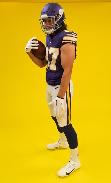
Why, if you are putting so much effort to get the look just right, do you make perfect versions of the jersey & the pants, but then drop the ball on the helmet? And here's the kicker...the Vikings are actually using a second helmet shell of a different color than their regular shade of purple. They had a chance to use the era-accurate glossy dark purple helmet shell. Instead, they opted for a lighter, matte purple than what was called for.


The Fix: If these throwbacks stick around, which I would guess they would, next year's throwback helmet will likely get fixed. I feel safe in that assumption. Why? Because the Vikings have done this before. 


As I stated in discussing Detroit's new helmet, when the Vikings debuted their current uniform set in 2014, the helmet didn't match. It was much too light. And it was highly noticeable on TV, to boot. Unfortunately, it took until 2019 for the Vikes to fix their purple helmets. But the point is, they did. This fix won't take as long. And like Philadelphia, these uniforms absolutely require black shoes, as well.

Grade: A-


#2 - TAMPA BAY BUCCANEERS

Bucco Bruce and the creamsicle orange jerseys have returned. Nike went the extra mile and made these versions a more vibrant shade of orange than their 2012 efforts which were much paler by comparison. Even the red trim really jumps out at you. These were extremely well done and historically accurate.


The Fix: Nothing. But there is one thing to look for as far as being historically accurate. On the back of the helmets where the striping ends, the Bucs have always cut off the bottom corner of the red stripes' outer edges. It's a quirky little detail that I will be looking for. For some reason, the Bucs' reveal didn't include photos of the backs of the helmets.


GRADE: A


#1 - TENNESSEE TITANS

Sorry to disappoint, Bucs fans, but these are just a little bit better. And it's funny but no one will look at these uniforms and call them Titans' throwbacks. These are OILERS uniforms.

Why are they better? Accuracy and attention to detail. The number fonts are a perfect match. The bold red outline goes BANG when you see them. But the best part of all is how they purposely mismatched the blues. Normally, this would be a problem but not here. Historically, these Oilers' blue jersey uniforms were done using two similar, but separate, shades of blue. 


The jersey's blue needs to match the blue pants stripe. It does. The blue of the socks is slightly darker and matches the blue in the helmet logo and stripe. They do. You had to be aware of this ahead of time to plan the outcome the way it needed to be. They did. And it's magnificent.

The Fix: Are you kidding??? One thing, Titans. PLEASE do not have players disrespect one of the greatest uniforms ever by wearing plain white socks instead of, or overtop of, the actual uniform's socks. PLEASE!

Grade: A+


That wraps it up, folks. One thing is certain, in a League dominated by darker colored jerseys, the majority of these throwbacks bring us back to a day when vibrant, colorful uniforms adorned our TVs every Fall weekend. That is a very good thing.


Bill Schaefer


Koo-Loo-Koo-Koo, Koo-Koo-Koo-Kooooo.


A frigid North Wind is blowing in from...well...the Great White North. In news that will surely make the day for Ryan Reynolds, Don Cherry, Wayne Gretzky, Mike Myers, and Celine Dion, the GUD is rolling out our first installment of the Canadian Football League.

Years ago we toyed with the idea of adding the CFL to the GUD but, after some digging, we realized we just didn't have the resources to make a legitimate run at it.

However, as I was perusing our close, personal ally - Newspapers.com - back in October, I noticed a major influx of Canadian newspapers being added. 

Montreal's Daily Star and Gazette, Ottawa's Journal and Citizen, Regina's Leader-Post, Edmonton's Journal and Bulletin, Calgary's Herald and the Albertan, and a bounty of newspaper publications from Vancouver and its neighboring area gave me a great degree of hope. Unfortunately, that left Winnipeg, Toronto, and Hamilton uncovered.

Toronto would be the first problem to solve, and the easiest. Our ProQuest library access includes Toronto's Globe and Mail as well as the Toronto Star, although the Star has not proven as useful as the Globe and Mail.

Next on tap was Winnipeg. With the help of the Winnipeg Public Library, I was provided a link to the University of Manitoba archives to access the Winnipeg Tribune. Subsequently, a small fraction of the Tribune has been recently added to Newspapers.com, but the archival assistance provided by the WPL and the University of Manitoba has been essential and limitless.

Finally, what to do about Hamilton? While there is an overflow of Ontario newspapers on Newspapers.com, no Hamilton newspaper can be found within its ranks. No problem. Again, a very resourceful Hamilton Public Library staff member has seen her way to rifle through four batches of requests for photos. Having all other teams essentially covered, the number of Hamilton games for which we were missing photos became much less than it could have been. I want to thank our 'Hamilton Goddess' Marisa for, what I'm sure, has been hours in front of a microfiche scanner searching for game photos. This project would have a huge, gaping hole in it if it wasn't for her. 

With the logistics taken care of, the next hurdle became the artistic one.

As a kid, I grew up watching NFL Films with clips from the 60s and 70s so when Tim Brulia and I began working on GUD, we each had a pretty good idea of uniform designs, emblems, and colors. At least for me, colors and number fonts were going to be the biggest problem here with the CFL. There just doesn't seem to be an archival CFL collection of vintage color videos or still photos from the 1950s anywhere online. If you know of one or can send me links to such locations, please reach out to us using the Contact Us tab up top or post the photos/links in our Forum.

1960 Argonauts with gold outline invisible on B/W newspaper photos

The practical view around these parts is that, just as was the case when we created GUD over 10 years ago, contacts with proof showing corrections and adjustments that need made to our initial representations will come pouring in. Not only is it a foregone conclusion, but it's a good thing, too. It's what makes the GUD the best uniform database on the Internet. It's also the main reason why this rollout is occurring the way it is. When we unleashed the GUD on the uni-verse, we put out about 80 years worth of images - all at once. One day I'd be correcting the 1940 Bears' pants stripes and the next day I was shortening sleeves for late-80s Bills' uniforms. Let me tell you, I didn't know whether I was coming or going for a while. It was a miracle 1940 Bears' uniforms didn't end up being displayed for the 1989 Bills - or vice-versa. 

We are limiting the 'Grand Opening' to a 16-season chunk, stopping at 1960. Why 1960, you ask? 1960 was the final year each Union played only teams from their own Union during the regular season. 1961 would feature a completely interlocking schedule. Additionally, it is our hope is that any images that need fixed can be done so in a shorter time frame, thus allowing us to continue our CFL rollout in 5-year chunks as time permits amid the rest of usual GUD business. The coming Spring features new XFL and USFL leagues as well as the obligatory releases of new NFL uniforms AND new/old throwbacks since the 1-Helmet Shell Rule has finally been lifted. The rest of the CFL will happen when time and life permit, but at least we are getting the ball rolling, hopefully sparking some new interest for both GUD and the CFL's history.

Speaking of the CFL's history, as I mentioned, aside from knowing the teams, I have to admit there are quite a few nuances to the Canadian brand of the game that I was completely oblivious to. I knew about the 55-yard line, the gigantic end zones, no 4th downs, and the ever-popular rouge. What has perplexed me the most so far has been how the playoffs were conducted back in the 1940s and 1950s. (I'm curious to learn whether these formats continued into the more modern era as I move forward.)

To begin with, the CFL began as 2 separate Leagues, or Unions - the Inter-provincial Rugby Football Union in the East (commonly referred to as the BIG 4) and the Western Inter-provincial Football Union out west. The IRFU and the WIFU. They met increasingly in preseason exhibition games and again at the end of the season where the two champions played in the Grey Cup, the Canadian version of the Super Bowl. (Honestly, it is we Americans who should be saying the Super Bowl is our version of the Grey Cup. The Super Bowl was first contested following the 1966 season. The Grey Cup was first awarded in 1909.) With these early season exhibitions and season-ending finale, the relationship between the two Unions was very similar to the one that existed between the NFL and AFL in the 1960s, minus the heightened degree of animosity. 

They continued to function as two entities until a joining in 1956 where both Unions functioned under the umbrella of the Canadian Football Council (CFC) for 1956 and 1957. Re-organization took place and the Canadian Football League was formed in 1958. 1961 actually marks a true modern beginning for the CFL as that was the season in which teams played, as mentioned, a completely interlocking, 9-team schedule.

Another similarity to the NFL/AFL comparison dealing with the schedules required some thoughtful decisions on our part. As the IRFU and WIFU functioned as two separate bodies, their starts and ends did not mesh. In other words, on a particular weekend the WIFU could be playing their 'Week 4' while at the same time the 'Big 4' IRFU teams were playing their 'Week 3.' A decision needed made on how we were going to deal with this problem. After careful thought, and not wanting to keep separate pages for both the IRFU and WIFU, we decided to show both Unions' 'Week 3' on the same page even though the dates did not match. We also split the weekly displays keeping the WIFU and IRFU images separated.

But let us move on from our 'Cliff Notes' version of my CFL tutorial and get back to those wacky playoffs. Generally speaking, each Union conducted a semi-final round featuring the #2 and #3 team from the season-long standings where the victor would play the Union team with the best record during the regular season. Sounds pretty simple, but the reality is far from it. From year-to-year, there seemed to be no consistency in the types of playoffs that were played. What do I mean, you ask? Some rounds were played as a straight-forward best-of-3 series while others were played in a 2-game total-points series where the scores of each team were totaled to make a cumulative score that would determine the series winner. There were even a few instances where the two teams were tied following the 2 total-points games and required to play a third game to settle things. These formats seemingly followed no set pattern for either Union. Perhaps someone with more scholarly knowledge of the CFL can help us out.

But wait...there's more... 

With apologies to our Canadian friends, there was something even more bizarre. Each season after the BIG 4 Champion was crowned, that team still had to win one additional game before moving on to the Grey Cup to face the WIFU Champion. The Eastern Championship and representation in the Grey Cup Final had to be determined in a game featuring the BIG 4 Champion against the champion from the O.R.F.U. (Ontario Rugby Football Union), essentially a not-quite-so-major league as the IRFU. Picture the Atlanta Braves having to beat a minor league champion before actually advancing to the World Series after already winning the NLCS! Records also show at least one instance in the 1950s where the ORFU Champion instead played against the WIFU Champion in a Grey Cup Semi-Final. From an outsider's perspective, it really seems like a lot of the early CFL playoff structures were set up on the fly. It appears this custom with the ORFU had its end in the late 1950s, so I guess sanity won out eventually over tradition.

Something else we've had to take a 'crash course' in were the team histories, a prime example of which are the Hamilton Tiger-Cats. Where the GUD begins, in 1945, Hamilton's IRFU team was known as the Tigers. At the same time (from 1941-47), a second Hamilton team, the Wildcats, played in the aforementioned ORFU. For reasons I won't go into, in 1948 the two Hamilton teams switched Unions. The Tigers moved to the ORFU and the Wildcats to the IRFU (Big 4). The next two years saw both teams struggle - both on the field and at the ticket gate. So, in 1950, the two teams merged for the inaugural season of the Hamilton Tiger-Cats.

Our images for the CFL teams will include a heavy dose of a feature new to GUD. As I began collecting newspaper photos of games, one thing became immediately apparent - these teams liked their big numbers, and I don't just mean the size of the numbers on their jerseys. Very few instances could be found of teams with player numbers in the single-digits, teens, or even 20s. Almost every player I was seeing was numbered in the 40s or higher. It was really unusual to see. Because of this fact, for the purpose of the CFL uniforms, I cast aside GUD's typical '11' for the jerseys that is seen throughout our site, instead opting for a random jersey number of a player found at the other end of the camera's lens. I then continued using that number until either the jersey style or the font, itself, changed.

Alouettes receiver Hal Patterson

In the late 1950s, teams began adding numbers to the sides of their helmets. But as the years went by and more teams began adding logos to their helmets, the numbers got moved to the back of the helmet, the front of the helmet, or both. To this point, we've never included front/back helmet numbers for other leagues. Yet with the CFL it became apparent that we could not avoid them any longer. 

When Part II of our CFL rollout takes place, GUD visitors will notice that, in 1962, the BC Lions moved their numbers from the sides of their helmet to the rear when they changed from a black-and-orange version of Michigan's 'flying wing' helmet to a black helmet with a lion's paw logo on the sides. The new helmet included a central orange stripe and two flanking, separated white stripes. The Lions placed the numbers to either side of the central orange stripe, thereby interrupting the white stripes from flowing all the way down the back of the helmet. Those of you familiar with our templates already know that we show a 'bird's-eye view' of the helmet's stripe detail. We could not show the white stripes going all the way down the back of the helmet on the stripe-view because, well, they didn't. Nor could we show the white stripes stopping short and leaving empty black space where the numbers should be. No, the only way to handle this is to include the helmet numbers for each CFL team, wherever they turn up. As stated, this will be seen in Part II of our CFL rollout when we publish 1961-65 in a few months.

9/17/62 - Hamilton @ BC

Finally, as was the case for several NFL teams back in the 1940s, only a very small number of CFL players wore socks. In some cases, teams went the entire season with nothing other than simple white sannies. This trend continued into the 1950s when there evolved, in most cases, an even split among teammates with or without socks. We have tried our best to display such vagaries, as always.

We hope you enjoy our foundation for what will eventually become the entire CFL history from 1945 forward. The wheels are turning. We will soon be assembling a list in our Forum of games for which we have been unable to locate photos for. Our visitors are welcome to provide demonstrative proof of an image that either needs minor adjustments or a complete overhaul. Please contact us. We welcome your contributions.

Bill Schaefer
GUD Graphics and Research 

The Shell Game

 So the NFL finally wised up and decided to do away with the 1-Shell Rule which limited teams to utilize only one set of helmet shells per season. Teams were permitted to alter the logos and stripes while retaining the same helmet shell to enable a design that would work with a team's alternate or throwback uniform.

The obvious question is...which teams will be taking advantage of the rule change? Here are my thoughts...

* - One-Star (almost a certainty not to happen)

** - Two-Star (possibility exists, but still not likely)

*** - Three-Star (better than 50/50 chance)

**** - Four-Star (should be carved in stone for 2022 or 2023)

** Arizona - Except for a short period a lifetime ago when the Cardinals used a red helmet, they have very little history in anything other than a white helmet. Could we see a cardinal red (or even a black) helmet? Sure, but probably not until they update their uniform template, whenever that is.

**** Atlanta - Almost a foregone conclusion the Falcons will utilize some form of red helmet going forward.

** Baltimore - The Ravens have never worn anything other than black helmets. As with Arizona, could we see a white or purple helmet? Possibly, but not likely.

**** Buffalo - The Mafia would love to see the Bills slide back into the Kelly-Era red helmets a few times each year. They'll get their wish.

*** Carolina - Despite only ever using silver helmets, the Panthers have long teased a black helmet. It is now more likely to happen at some point.

* Chicago - Won't happen. Their navy helmets work well with their 1930s throwback.

**** Cincinnati - On the heels of a Super Bowl appearance, the Bengals will likely create a white shell version of their helmet to wear with their white jersey uniforms a few times. (Am I the only one who would also  like to see the Bengals go old-school to the 70s with "BENGALS" on the sides?) 

**** Cleveland - With their 1946 throwback they unveiled last season, the only missing piece to truly authenticate the uniform would be a plain white helmet. It will happen this year.

**** Dallas - Do you honestly think the Cowboys would pass up an opportunity to pair a white throwback helmet with a throwback jersey? The tail wags the dog here to boost jersey sales for Jerry.

*** Denver - The big "D" logo just doesn't look as good on a navy shell as it did on a lighter blue shell. Better than fair chance Broncos' fans get it.

** Detroit - As bad as the all-grey uniforms are, I just can't see Detroit compounding the mistake and adding a helmet that isn't silver. But what if the Lions did a Portsmouth Spartans throwback? Could a purple helmet happen?

* Green Bay - We're not seeing Green Bay in something other than yellow helmet shells. Period.

** Houston - The only chance is if the Texans break out a white helmet. Their original prototype was white, not navy.

** Indianapolis - Their throwbacks looked really nice last year. Eventually the blue helmet will return with a throwback as it did in 2010. Eventually. But not now.

** Jacksonville - A teal helmet, perhaps? Ick. But this is the same franchise that gave us those 2-tone monstrosities...

* Kansas City - Not gonna happen.

* Las Vegas - Ditto. However, I was truly disappointed the Raiders missed the 'golden' opportunity when they moved to Vegas. They could have gone to a silver chrome helmet and not skipped a beat.

**** LA Chargers - A Junior Seau-Era navy helmet? Yes, please. A Dan Fouts-Era version? Options 1A and 1B.

* LA Rams - Just won a Super Bowl. Just changed uniform templates after a run with a handful of different horn colors and shapes. A hard pass for at least the next few years.

* Miami - Their throwbacks, which should be made their everyday uniforms, look too good with the white throwback helmets. If it ain't broke, don't fix it.

*** Minnesota - The casual observer might not have noticed but, prior to the 1-Shell Rule, the Vikings occasionally wore a dark purple throwback helmet with the vintage style horn logos. Likely they make a return.

**** New England - Foregone conclusion as Pat Patriot returns on white helmets.

**** New Orleans - 'Old gold' helmets can now return to be paired with the Saints' Color Rush uniform. Now if only they would add appropriate socks to complete that look instead of the ultra-bland plain white socks.

** NY Giants - The Giants' blue helmets work well with their 'throwback/Color Rush' uniforms even though, technically, the throwback/CR helmets should be navy. Also, 'slim' to 'no chance' we see red or white helmets from the 1920s or 1930s.

*** NY Jets - The Jets just adopted a new template. Is it too soon for a white-helmet throwback?  Better than 50/50 the white helmets return on a part-time basis.

**** Philadelphia - Consider this a done deal. Kelly green helmets will return. Ownership will cave to fan pressure. But will it be in 2022 or 2023?

** Pittsburgh - Since the 'bumblebees' were retired, Pittsburgh has needed a new throwback uniform. Are the 'Batman' uniforms from the 1960s making a comeback? If so, there wouldn't be a need for a yellow helmet. Could a new throwback be something else that does require a yellow helmet?

**** San Francisco - The 1955 throwbacks with the drop-numbers that the Niners wore last year were actually worn with red logo-less helmets with a wide silver stripe back in the day. Highly likely that red helmets get added or even the more stylish silver helmets worn from 1948-52 and again from 1959-63. Either would be a nifty, new addition.

**** Seattle - The silver-helmet uniforms from the last century will return...but not until 2023. Sorry Seahawks fans, but it will be worth the wait.

**** Tampa Bay - As with the Seahawks, Bucco Bruce will return, but not until 2023.

** Tennessee - The Titans will not wear a white Oilers helmet. Could they come up with a Columbia blue version of the current model?

** Washington - They will not use a Redskins throwback helmet of any color. Could they compound the mistake that is their new Commanders look by throwing in a black or...gulp...camo helmet? Of course they could. It's what they do. Both would be a mistake.

What are your thoughts? What would you like to see? Does anyone have any inside information they'd like to share?

Bill Schaefer - GUD

A Bit of Nostalgia

 Hello, out there in GUD-land. Today I have a surprise for you and it's not about something on GUD.

...Well...actually...it is, but only as a side-effect.

Let me explain.

If you've ever taken the time to read our 'About' section, you've become familiar with our story of how I 'found Tim' and we began working together to hatch what would become GUD. However, there's a part of the story that tends to go unnoticed, itself having been forgotten by many and an afterthought to everyone else. We sought to rectify that.

When I moved to Florida to begin teaching at a new school in 2002, I was presented with a desktop PC in my classroom. During lunches, I would surf the internet. One site became a frequent location of my visits...Football Uniforms: Past and Present (FUPP)

Even back then, I was a football nerd. Doodling helmets and logos. Coloring them in with colored pencils. It was therapeutic. It relaxed me. Having a website that had NFL uniforms? I was in heaven.

Shortly after discovering the site, I noticed a few short-comings. Using the 'Contact' tab, I wrote to the site's creator, Craig Wheeler. Growing up the son of a Steelers' season ticket holder, I knew that the Steelers had worn a 50th anniversary patch in 1982 that wasn't being shown on FUPP. I found some photos online and sent them to Craig. About a week later, Craig posted the update. I was so proud of myself and my contribution!

Over the next few months I found other instances of improvements that could be made and kept sending them to Craig. I can only imagine what Craig was thinking every time one of my emails popped up in his inbox.

But all good things must come to an end. After the 2003 season, as we say around the GUD, "Life happens." Craig could no longer put forth the effort to maintain the site on a yearly basis. 2003 would be the last year of additions to FUPP. The site remained in stasis for a number of years. At some point, the address for FUPP changed slightly to include the name "Weirdwolf." FUPP and its domain were taken control of by Lynn "Weirdwolf" Schmidt who kept the site up and running, but not updating, for several more years, until finally, the site disappeared off of the internet for good.

Past and Present was truly the first of its kind, dedicating images and research to maintaining an important aspect of NFL history. And now it was gone. 

It has now been 10 years since the Gridiron Uniform Database first appeared online. We've consistently improved and built into something bigger than any of us ever imagined. But everything we've become we owe to Football Uniforms: Past and Present for paving the way and opening the door for us. And that is why a decision was made.

We, at GUD, decided we wanted to honor the 'founding father of NFL uniform history' by displaying his graphics here within the Gridiron Uniform Database. With the help of Donovan Moore, creator of ColorWerx - now known as TruColor, we were able to reach out and gain permission from Mr. Wheeler to display his work on our site.

When Craig stopped updating FUPP beyond 2003, I was annoyed. I had downloaded his images and was using them as screensavers. What was I to do in 2004? It was then that I first began my graphic efforts to update Craig's images to suit the changes to uniforms made in 2004 and beyond. Oh boy were they bad. But I didn't worry because no one else was ever going to see them. But I made one tremendous mistake. When I made the changes and altered images like darkening the Patriots' and Broncos' navy blues from the shade Craig had used, I saved them by over-writing the originals. Gone was my 'vintage set' of Craig Wheeler originals.

For months I searched online even going into Chris Creamer's Forum where people had displayed Craig's images from time to time. But those entries were so dated that I was unable to make contact with the guests who had posted them there.

Finally, last week, I had a breakthrough. I found Lynn "Weirdwolf" Schmidt on Facebook. I made contact with him and asked, in his capacity of having taken over the domain of FUPP years before, did he ever take the opportunity to download the images for safe keeping?

He had, with one caveat.

"Weirdwolf" downloaded the images in July 2003, before the 2003 season began. Craig Wheeler had posted images for the 2003 season after its completion. But not to fear, I still had the 2003 images like the 'new for 2003 Falcons' uniforms,' the Texans in red jerseys, the Dolphins in orange jerseys largely untouched in Craig's template as he designed them.

"Ww" made the images and all of the key technical components available to us. However, coding from a 2000 website obviously has fallen a bit behind the times. But our own tech-master, Austin Snelik, is a miracle worker. In short order, he was able to get FUPP back up and 99% viewable as part of GUD. 

Thank you, "Weirdwolf," for your contribution to this project. Like us, I know you wanted Craig's work not to disappear forever. And thank you, Austin, for taking the time to resurrect FUPP for us old guys and placing a link to FUPP's new home on GUD's 'Links' page.

A single small problem still exists with our recreation. One image, the 1966 Houston Oilers, shows up as 'unavailable.' I'm not sure why that appears that way. The 1965 Houston Oilers image should also be the one posted for 1966, as well. We are working to get that corrected.

While Past and Present will stand as a gallery of Craig Wheeler's work and will not be updated any further, the largest omission from this 2021 version is the missing 2003 season. I will fill in that gap by posting Craig's original 2003 images within this blog entry. Of note, Craig never included 'Preseason Only' combos and he hardly ever included patched jerseys as separate combos. In order to consolidate space here, I have removed the sectioning lines and placed all combos on a single image.

2003 Arizona


2003 Atlanta

2003 Baltimore


2003 Buffalo


2003 Carolina


2003 Chicago


2003 Cincinnati


2003 Cleveland


2003 Dallas


2003 Denver


2003 Detroit


2003 Green Bay


2003 Houston


2003 Indianapolis


2003 Jacksonville


2003 Kansas City


2003 Miami


2003 Minnesota


2003 New England


2003 New Orleans


2003 NY Giants


2003 NY Jets


2003 Oakland


2003 Philadelphia


2003 Pittsburgh


2003 St. Louis


2003 San Diego


2003 San Francisco


2003 Seattle


2003 Tampa Bay


2003 Tennessee


2003 Washington


As the first of its kind, FUPP was ahead of it time. But life happens. We all understand that. It's just that, as history buffs with a pro football inclination, we hated to see Craig's work disappear from the digital landscape and be lost to time. Now, we can be assured that Craig Wheeler's contribution will never, ever, be forgotten again. 

Thank you, Craig.


Bill Schaefer


Tim Brulia here to add some thoughts.

I echo Bill's sentiments on FUPP 100%. Until this post by Bill, I thought I was the main P.I.T.A. for Craig, with my numerous emails for revisions! Our official 10th Anniversary will be June 12. But without question, FUPP was the spark and inspiration to continue the journey to compile the best and most accurate uniform history of  "America's Game." 

We feel that Craig planted the seeds of visual pro football uniform research and turned into a strong sapling. From there, we took to takeover the nurturing of the tree to a full grown tree with many branches; the teams, the years and the games with the help of so many contributors. 

Without Craig laying the foundation of FUPP, the GUD likely would never have gotten off the ground. That's why when the GUD launched in 2011, we dedicated this site to Mr. Wheeler. Craig, we hope we done ya "GUD!"

Salut!

TB


Twitter

Blog Archive